NicheFinds | Case Study
Logo

NicheFinds

NicheFinds

NicheFinds

A coordination app designed to make discovering and organizing niche events seamless.

A coordination app designed to make discovering and organizing niche events seamless.

Client

Personal Project

Timeline

2 WeEks

Services

UX/UI, Brand Design

Role

Product designer

  • User Research · Branding · Prototyping · Usability Testing

  • User Research · Branding · Prototyping · Usability Testing

  • User Research · Branding · Prototyping · Usability Testing

Swipe into your next adventure

SIMPLIFIED
Event PLANNING

SIMPLIFied
Event
PLANNING

Context

Context

Coordinating local activities with friends is often fragmented and time-consuming, requiring multiple platforms for discovery, communication, and booking, resulting in frustration and missed social opportunities.

Action

Action

My goal was to simplify social planning by providing users with a centralized platform to discover local events, connect with friends, and coordinate activities effortlessly.

Results

Results

Developed an intuitive flow for seamless group coordination and planning, integrating features like polls to simplify decision-making with friends.

Hi-Fi Design Discovery Page
Empathize
Empathize
Empathize

Discovering a Solution for Local Events and Creativity in One Place

With more people seeking creative outlets and meaningful experiences, the goal was to support local businesses and foster a sense of community by making it easier for users to find and engage with these opportunities.

Competitive Analysis

Conducted market research and competitive analysis on leading event discovery apps. Initially approached the project as a discovery-focused app, but after deeper analysis and multiple revisions to the competitive landscape, I pivoted to a planning-oriented approach.

A comparison table showcasing three companies: Yelp, GO, and Instagram. Each column includes the company name, a brief description of its purpose (Yelp: "Connecting consumers with local business," GO: "Curated recos for like-minded tastemakers," Instagram: "Social sharing platform"), and features such as In-App Messaging (X for Yelp, check for GO and Instagram), Event Profiles (check for Yelp and GO, X for Instagram), Polls (X for Yelp and GO, check for Instagram), Imagery (check for all three), and Log In (check for all three). Icons indicate the presence or absence of each feature.

Instagram: Visually engaging for discovery but lacks integrated planning or coordination tools.

AmiGO: Offers local recommendations with basic planning features but an inconsistent interface hampers coordination.

Yelp: Detailed reviews and business info, but planning tools like bookmarks and reservations are clunky and poorly integrated.

Instagram: Visually engaging for discovery but lacks integrated planning or coordination tools.

AmiGO: Offers local recommendations with basic planning features but an inconsistent interface hampers coordination.

Yelp: Detailed reviews and business info, but planning tools like bookmarks and reservations are clunky and poorly integrated

Primary Research: Survey & User Interviews

To validate the concept and uncover user pain points, I conducted surveys for quantitative insights and user interviews for deeper behavioral understanding.

85%

Of users frequently share event/activity recommendations with friends.

Of users frequently share event/activity recommendations with friends.

78%

Of users say that the biggest challenge in organising plans with friends is reaching a consensus on the plan.

Of users say that the biggest challenge in organising plans with friends is reaching a consensus on the plan.

68%

Of users say that reminders and prompt updates would be beneficial when planning.

Of users say that reminders and prompt updates would be beneficial when planning.

Combine discovery, planning, and coordination in one seamless platform for a smarter, more connected user experience.

Combine discovery, planning, and coordination in one seamless platform for a smarter, more connected user experience.

Combine discovery, planning, and coordination in one seamless platform for a smarter, more connected user experience.

Define

Crafting the User Persona

Designing for Organized, Social Planners Who Value Efficiency

A user persona titled "Jenna, 'The Planner'," featuring a profile image and traits like Extrovert, Outgoing, Organized, Tech-Savvy, Ambitious, and Type-A. The persona is divided into three sections: Goals (e.g., discovering and organizing activities in one platform, booking quickly, sharing plans with friends), Frustrations (e.g., messy expense tracking, tedious payment reminders, juggling multiple apps for planning), and Motivations (e.g., social interaction, exploration, efficiency, and convenience, with convenience and efficiency ranked highest). The layout visually communicates Jenna's personality, needs, and pain points.
The user journey map revealed scheduling challenges, emphasizing the need for simpler, more collaborative planning solutions.

Pain Points and Frustrations in Planning

The user journey map uncovered the core frustration of scheduling with multiple people, highlighting the complexity and stress it brings. This insight underscored the importance of designing solutions that simplify coordination and make planning effortless for users.

The user journey map revealed scheduling challenges, emphasizing the need for simpler, more collaborative planning solutions.

Understanding User Needs from Journey Mapping

User journey mapping highlighted key frustrations, like coordinating with groups and scattered tools and developed the primary needs of the app.

 A flowchart depicting the user journey for organizing an event, starting from the Splash Page and ending with a Group Message. Key steps include Login (or creating an account), navigating to the Discovery Page, clicking on an event to view Event Details, and selecting friends to share the event. Decision points like "Shares Link" and "Send as Group" are highlighted with diamonds, showing options for users to edit messages or send invites. The chart visually separates Happy Path, Alt Path, and Error Path, with each action categorized into pages, displays, or decision points.
 A flowchart depicting the user journey for organizing an event, starting from the Splash Page and ending with a Group Message. Key steps include Login (or creating an account), navigating to the Discovery Page, clicking on an event to view Event Details, and selecting friends to share the event. Decision points like "Shares Link" and "Send as Group" are highlighted with diamonds, showing options for users to edit messages or send invites. The chart visually separates Happy Path, Alt Path, and Error Path, with each action categorized into pages, displays, or decision points.
 A flowchart depicting the user journey for organizing an event, starting from the Splash Page and ending with a Group Message. Key steps include Login (or creating an account), navigating to the Discovery Page, clicking on an event to view Event Details, and selecting friends to share the event. Decision points like "Shares Link" and "Send as Group" are highlighted with diamonds, showing options for users to edit messages or send invites. The chart visually separates Happy Path, Alt Path, and Error Path, with each action categorized into pages, displays, or decision points.
Problem to solve: Urban explorers struggle to discover and plan visits to unique local spots, as existing platforms prioritize established venues, making coordination time-consuming and unreliable.

Prioritizing Features using the RICE Methodology

With many potential features, I defined the MVP by aligning scope with user needs and business goals. Prioritized based on high-impact, feasible features to create a focused, scalable foundation before design.

Concept testing revealed users craved seamless collaboration, so I introduced these three features to simplify decision making and make planning easy AND fun.

Group Polls

Group Polls

Introduced interactive polls within group chats, enabling real-time voting on niche items and decisions for efficient collaboration.

Introduced interactive polls within group chats, enabling real-time voting on niche items and decisions for efficient collaboration.

Chatbot

Chatbot

For ease of navigation and coordinating, introduce a chatbot to keep the planning going.

For ease of navigation and coordinating, introduce a chatbot to keep the planning going.

Streamlined Process

Streamline

Streamline

Simplified actions by aggregating links, enabling one-tap checkouts, and using AI-generated summaries to help groups move smoothly from decision to action.

Simplified actions by aggregating links, enabling one-tap checkouts, and using AI-generated summaries to help groups move smoothly from decision to action.

IDeATING

Developing the MVP to remove friction and add to joy to planning

Developed iterations of the site map and user flows, focusing on the MVP: simplifying friend coordination. The main task flow showcases our user, Jenna, going through the coordination process of booking and paying for an event with her friends. There are 3 paths, happy, alternative and error.

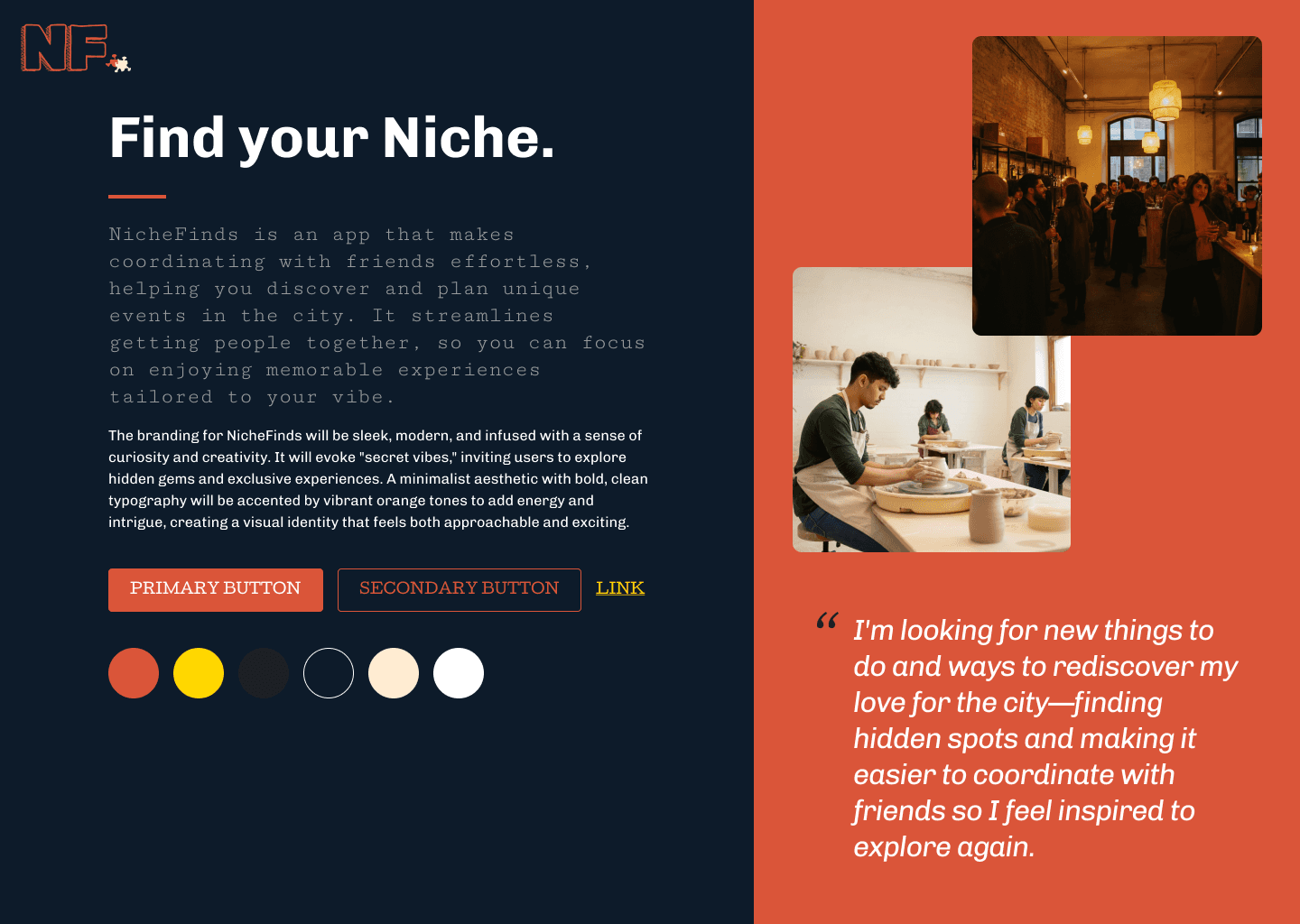
Crafting a Sleek, Niche-Focused Brand Identity

Through an iterative exploration, achieved a sleek, niche-focused identity. Experimenting with logos and colour palettes.

“I think the branding really aligns with the app being a place to explore fun/creative things to do and connect with your friends.”

“I think the branding really aligns with the app being a place to explore fun/creative things to do and connect with your friends.”

“I think the branding really aligns with the app being a place to explore fun/creative things to do and connect with your friends.”

Prototyping

Visualizing Solutions to Address Coordination Challenges

Designed low-fidelity wireframes to map out the key features and flows, focusing on simplifying group coordination. By creating multiple iterations, I tested and refined ideas to ensure the design met user needs and tackled pain points effectively.

It includes typography, color schemes, logos, and various UI components like buttons, modals, chat interfaces, and other elements typically used in application design.

Design System and Developer Handoff

While I didn’t work directly with developers, I ensured a smooth handoff by implementing a structured design system and proactive collaboration strategies. Factoring in technical feasibility from the start, aligning with developers on constraints and requirements. For example, during the money transfer feature exploration, I identified early on that its complexity exceeded the project’s timeline, preventing costly late-stage pivots.

Maintained a well-documented design systems, including annotated fonts, spacing, and interactions, ensuring clarity in execution. I designed with accessibility in mind and kept assets meticulously organized—naming conventions, files, and consistent UI patterns helped developers onboard quickly and implement designs accurately when necessary.

Design System and Developer Handoff

While I didn’t work directly with developers, I ensured a smooth handoff by implementing a structured design system and proactive collaboration strategies. I factored in technical feasibility from the start, aligning with developers on constraints and requirements. For example, during the money transfer feature exploration, I identified early on that its complexity exceeded the project’s timeline, preventing costly late-stage pivots.

I maintained well-documented design systems, including annotated fonts, spacing, and interactions, ensuring clarity in execution. This allowed developers to reference specs easily without unnecessary back-and-forth. I designed with accessibility in mind and kept assets meticulously organized—naming conventions, pixel-perfect files, and consistent UI patterns helped developers onboard quickly and implement designs accurately.

TestING

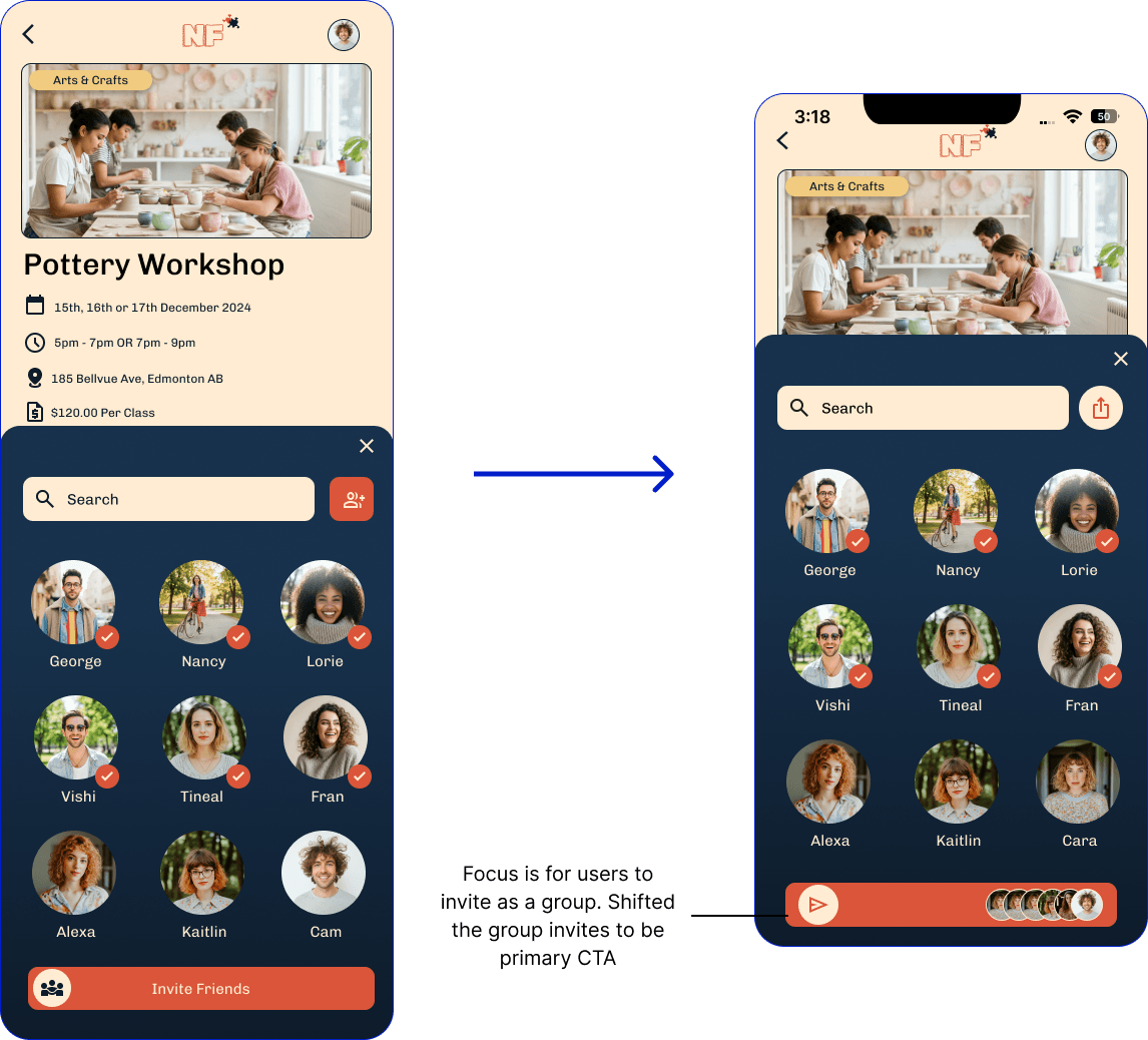
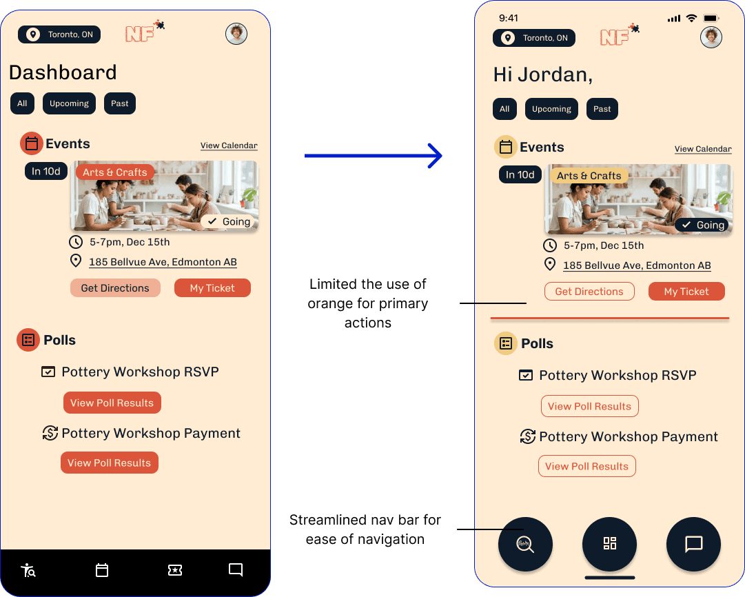
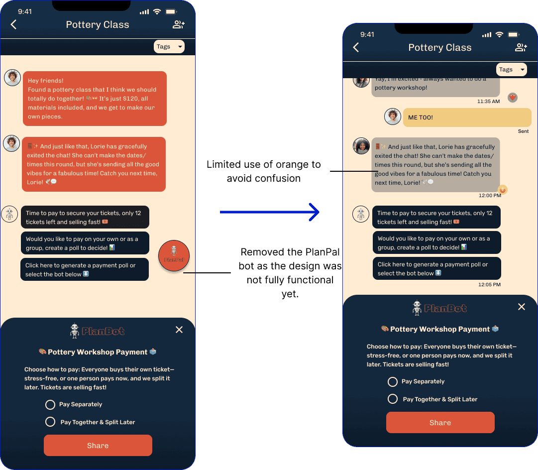
Enhancing CTAs and Navigation for Future Iterations

For usability testing, I created five key tasks for users to complete, including inviting friends to a pottery class, sharing an RSVP poll, voting and messaging, sending a payment poll, and viewing their ticket. The goal was to test the clarity and flow of the coordinating process.

Iterating on the designs..
It includes typography, color schemes, logos, and various UI components like buttons, modals, chat interfaces, and other elements typically used in application design.
Final Designs
Reflection

The final NicheFinds app evolved from early pivots, shifting from event discovery to solving the core problem of planning and coordination, as highlighted in user research. By focusing on user needs, the app streamlined group planning with practical, intuitive, and collaborative features.


User testing reinforced its success, with participants praising its ability to simplify scheduling and bring people together. NicheFinds ultimately filled a key market gap by providing an all-in-one platform for effortless coordination and connection.

View Prototype

  • Let's Work Together ·

Let's Work Together!

  • Let's Work Together ·

Let's Work Together!

  • Let's Work Together ·

Let's Work Together!